The contents of this page have been taken over by the new project.
sin = np.sin(np.arange(0, np.pi*2, 0.1))  # 0,  0.09983342,  0.19866933,  0.29552021,  0.38941834, ...
two_inverted_sin = np.array([sin, -1 * sin]).T
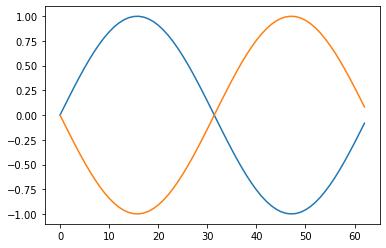
audio_plot.plot(two_inverted_sin)
audio_plot.plot(two_inverted_sin, ptype="overlay")
audio_plot.plot(two_inverted_sin, duration=200, min_freq=130.813/2, max_freq=130.813*3, labels=["A", "B"])
df = pd.read_csv("https://raw.githubusercontent.com/nytimes/covid-19-data/master/us-states.csv")
new_york = df[(df.state == "New York") & (df.date > "2020-03-01")].deaths.values
texas = df[(df.state == "Texas") & (df.date > "2020-03-01")].deaths.values

new_york_and_texas_death_since_march = np.array([new_york, texas]).T
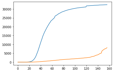
audio_plot.plot(new_york_and_texas_death_since_march, labels=["new york", "texas"])